Enterprise Learning Experience – Adoption & Engagement
Redesigning information architecture and navigation to improve completion and onboarding speed
Enterprise Learning Experience – Adoption & Engagement
Redesigning information architecture and navigation to improve completion and onboarding speed
Role
Sole product designer, worked on research, facilitating ideation workshops, prototyping, testing, and delivery.
Team
Product Designer, Product Manager, 2 Back-end Engineer, 2 Front-end Engineer
Company
XU Group
Year
2022-2025

01.
Intro
XU provides digital learning for enterprise clients across topics like AI, ESG, and sustainability. When I joined, the platform was a legacy system built by an external agency. It felt outdated, made simple tasks difficult, and limited the company’s ability to scale.
My work focused on redesigning the learning and admin platforms to create a clearer structure and a simpler experience. The goal was to help users understand where to start, reduce friction in daily tasks, and give internal teams more control over the product.
This case study shows how I reshaped the platform’s IA, improved key learning flows, and rebuilt the admin tools to support faster setup and better product storytelling for clients and investors.
01.
Intro
XU provides digital learning for enterprise clients across topics like AI, ESG, and sustainability. When I joined, the platform was a legacy system built by an external agency. It felt outdated, made simple tasks difficult, and limited the company’s ability to scale.
My work focused on redesigning the learning and admin platforms to create a clearer structure and a simpler experience. The goal was to help users understand where to start, reduce friction in daily tasks, and give internal teams more control over the product.
This case study shows how I reshaped the platform’s IA, improved key learning flows, and rebuilt the admin tools to support faster setup and better product storytelling for clients and investors.
What I did
UX audit of the legacy platform
Unmoderated user testing
Information architecture redesign
Flow design for learning and admin tasks
Interactive prototyping
UI design for web and mobile
Early design system foundations
Handoff support and QA with engineering
What I did
UX audit of the legacy platform
Unmoderated user testing
Information architecture redesign
Flow design for learning and admin tasks
Interactive prototyping
UI design for web and mobile
Early design system foundations
Handoff support and QA with engineering
Outcomes
34%
increase in course completion
40%
Faster start to learning
Outcomes
34%
increase in course completion
40%
Faster start to learning
02.
Discovery
Understanding the problem
The legacy platform made core learning tasks harder than they needed to be. While users could eventually complete most tasks, the friction slowed learning progress, reduced engagement, and limited the platform’s ability to scale across new enterprise clients.
For the business, this meant lower engagement, slow course completion, and more support requests from clients. Internally, the team couldn’t update the platform without external help, which slowed releases and limited growth. To understand where the experience was breaking down, I combined three inputs: a UX audit of the legacy system, unmoderated tests with 11 participants, and a review of common LMS/LXP patterns.
Business objectives
To understand what the redesign needed to support, I clarified the core business goals with product, sales, and engineering.
Build a product the company could fully own and adapt as new enterprise clients joined.
Clarify the core learning journey to improve adoption and help users progress without friction.
Make setup and configuration simple so sales and account teams could prepare demos and onboard clients without engineering support.
Create a more consistent platform to support future features without heavy redesign work.
UX Audit
The audit revealed issues that made the platform hard to navigate and scan:
Redundant sections made it unclear where learning content lived.
Inconsistent UI created friction in simple interactions.
Low contrast and small text made important actions easy to miss.
Unstable layouts caused content to shift as users interacted.
These issues pointed to the need for a cleaner structure, clearer language, and a more stable interface.

🔴 Mixing content with navigation
🔴 Severe contrast and accessibility issues
🟡 Too many elements leading to cognitive overload
🟡 Unclear navigation
🔴 Mixing content with navigation
🔴 Severe contrast and accessibility issues
🟡 Too many elements leading to cognitive overload
🟡 Unclear navigation

🔴 Low contrast text on dark background
🟡 Cluttered design: too many font sizes and weights
🟡 Dense content reducing readability
🔴 Low contrast text on dark background
🟡 Cluttered design: too many font sizes and weights
🟡 Dense content reducing readability
Competitor research
I reviewed leading LMS and LXP products to understand what worked well in modern learning tools. Clear patterns stood out:
Simple navigation with a single place to start learning
Clean layouts with essentials only
Progress and tasks visible at all times
Admin tools that reduce setup steps
These patterns helped anchor design decisions for both learners and admins.

Layout and navigation
✓ Clean layouts with just the essentials
✓ Easy navigation an understandable lables
✓ Quick access to progress and tasks


Simple and familiar learning experience
✓ Clear structure with the lesson list on the side.
✓ Easy to follow videos, readings, and quizzes.
✓ Good feedback on what’s done and what’s next.


User testing
I ran unmoderated tests with 11 users aged 30 to 55. They were asked to log in, explore the dashboard, start a course, ask a question, and search for content. Task success was 55%. Most users could complete tasks, but not without guessing or backtracking.
User testing
I ran unmoderated tests with 11 users aged 30 to 55. They were asked to log in, explore the dashboard, start a course, ask a question, and search for content. Task success was 55%. Most users could complete tasks, but not without guessing or backtracking.
Main challenges
Navigation clarity
42%
understood the dashboard
Finding content
58%
struggled to find a course
Readability and scanning
64%
reported readability issues
Main challenges
Navigation clarity
42%
understood the dashboard
Finding content
58%
struggled to find a course
Readability and scanning
64%
reported readability issues

Key themes that shaped the redesign
Key themes that shaped the redesign
03.
Design
I worked with the PM to define what the new platform should do well. We reviewed every feature from the legacy system. Some features, like Exchange and the older Live Sessions flow, created little value and added complexity for users and engineering. We agreed to decommission them so we could focus our effort on the core learning experience. This alignment helped ensure design decisions balanced user needs, technical constraints, and go-to-market requirements.
Based on the insights, the redesign focused on three areas:
Give users a clear starting point
Simplify the navigation and content structure
Reduce friction in daily tasks for learners and admins
The platform relied on a headless CMS for content delivery, which defined how courses and modules were structured. Rather than redesigning the content model itself, I focused on improving clarity through hierarchy, labeling, and layout within those constraints.
Ideation
I explored different dashboard layouts to see how we could support future features without redesigning the platform each time. One direction was a bento-box layout made of modular cards. The idea was simple: each block should work on its own, but also scale when more data or features appear. I tested different densities and groupings to see how users might read the page and move through tasks. These explorations helped me understand what information needed to be visible upfront and what could sit in secondary areas.

Early modular dashboard exploration using a bento layout
Early modular dashboard exploration using a bento layout

Exploring the possibilities of adding new features in the future
Exploring the possibilities of adding new features in the future
Designing for clarity
The old platform split content across several sections with similar names, which caused confusion and mis-clicks.
I reworked the information architecture to reduce the number of main sections and give each one a clear purpose.
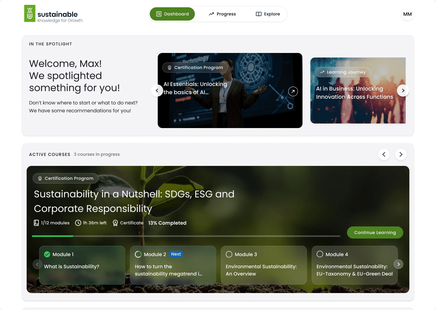
The navigation moved from a wide side menu to a simpler top navigation with three core areas. This gave users more space to see content and made it obvious where learning begins.
I validated the proposed three-part navigation using a closed card-sorting exercise. Most content naturally grouped into Dashboard, Explore, and Progress. A few edge cases, like live sessions and certificates, revealed overlap early, allowing us to clarify ownership before finalizing the structure.
Designing for clarity
The old platform split content across several sections with similar names, which caused confusion and mis-clicks.
I reworked the information architecture to reduce the number of main sections and give each one a clear purpose.
The navigation moved from a wide side menu to a simpler top navigation with three core areas. This gave users more space to see content and made it obvious where learning begins.
I validated the proposed three-part navigation using a closed card-sorting exercise. Most content naturally grouped into Dashboard, Explore, and Progress. A few edge cases, like live sessions and certificates, revealed overlap early, allowing us to clarify ownership before finalizing the structure.

Card sorting to test whether content naturally grouped into Dashboard, Explore, and Progress
Card sorting to test whether content naturally grouped into Dashboard, Explore, and Progress
Solution
A simpler and more readable interface
Readability was a major issue in the legacy platform. Small text, low contrast, and tight spacing made scanning slow and tiring.
I introduced a cleaner layout system with stronger hierarchy and more breathing room.
I removed visual noise, reduced animations that caused layout shifts, and created stable page structures that load predictably.
What changed
Larger, clearer typography
Fewer competing elements on each page
More consistent spacing


Before
After
A clearer learning flow
Users often guessed their way into courses. To fix this, I redesigned the course cards and course layout to make actions clear.
“Start” and “Continue” became the primary actions. Progress is now visible on each course card and at the top of the course itself.
The focus is on helping users understand how far they’ve come and what to do next.
What changed
Clear “Start” and “Continue”
Visible progress indicators
Simple, linear structure inside each course
Fewer distractions around the content
A clear starting point with personalized recommendations
A clear starting point with personalized recommendations

A simple, structured way to browse all learning content.
A simple, structured way to browse all learning content.
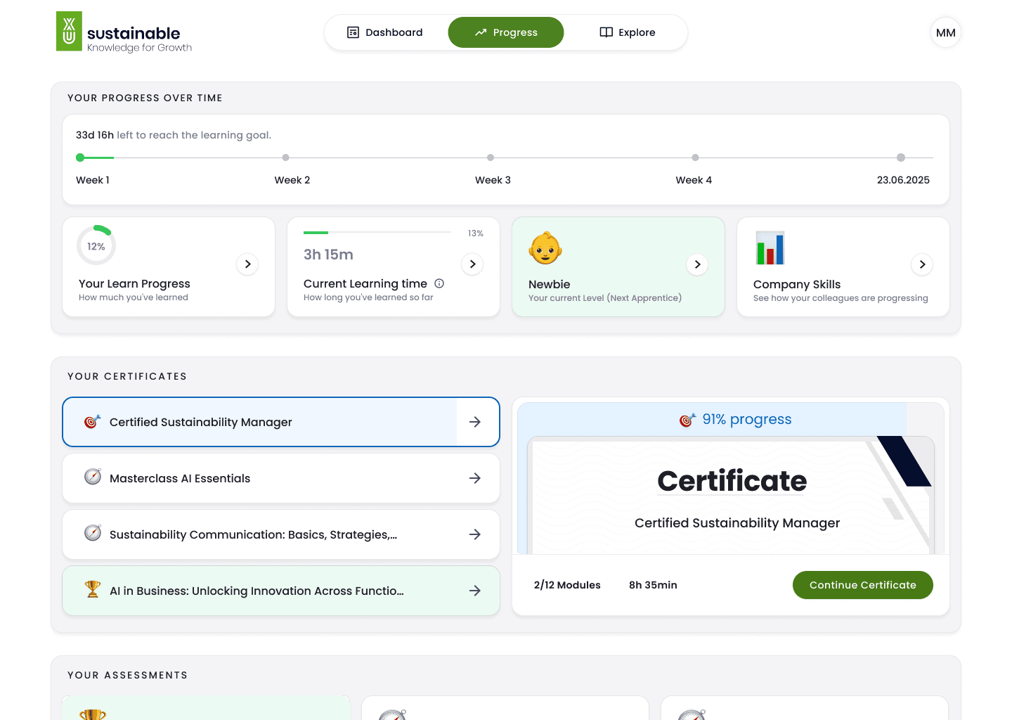
A transparent overview of milestones and achievements
A transparent overview of milestones and achievements
04.
Impact
The redesign focused on making learning easier to start, easier to continue, and easier to complete. By reducing navigation choices, clarifying labels, and making progress visible, users spent less time figuring out the interface and more time learning. Outcomes were measured through a combination of usability testing signals and post-launch product metrics tracked by the product team.
The redesign focused on making learning easier to start, easier to continue, and easier to complete. By reducing navigation choices, clarifying labels, and making progress visible, users spent less time figuring out the interface and more time learning. Outcomes were measured through a combination of usability testing signals and post-launch product metrics tracked by the product team.
34%
Improved learning completion
Clear entry points and visible progress helped users stay oriented within courses. Fewer interruptions and less backtracking reduced drop-offs during learning.
40%
Faster start to learning for first-time users
A simplified dashboard and clear “Continue learning” actions reduced the time it took users to begin a course after logging in.
Fewer support tickets related to learning content
Clearer navigation and more stable interactions reduced questions about content access and basic platform behavior.
A scalable foundation for future learning features
The simplified IA and modular layout allow new content and formats to be added without redesigning core learning flows.
04.
Impact
The redesign focused on making learning easier to start, easier to continue, and easier to complete. By reducing navigation choices, clarifying labels, and making progress visible, users spent less time figuring out the interface and more time learning. Outcomes were measured through a combination of usability testing signals and post-launch product metrics tracked by the product team.
34%
Improved learning completion
Clear entry points and visible progress helped users stay oriented within courses. Fewer interruptions and less backtracking reduced drop-offs during learning.
40%
Faster start to learning for first-time users
A simplified dashboard and clear “Continue learning” actions reduced the time it took users to begin a course after logging in.
Fewer support tickets related to learning content
Clearer navigation and more stable interactions reduced questions about content access and basic platform behavior.
A scalable foundation for future learning features
The simplified IA and modular layout allow new content and formats to be added without redesigning core learning flows.
05.
Learnings
This project reinforced how much clarity, structure, and constraints shape both user experience and product velocity. The learnings below reflect what worked, what required trade-offs, and what I would approach differently next time.
Clarity beats feature richness
Reducing scope had more impact than adding functionality. By decommissioning low-value features and simplifying navigation, users progressed faster and with more confidence. This reinforced that clarity and focus are often the strongest UX improvements, especially in complex enterprise products.
“Good enough” task completion isn’t success
Although many users could complete tasks on the legacy platform, they did so slowly and with frequent backtracking. This project sharpened my understanding that usability is not just about completion, but about confidence, speed, and cognitive load along the way.
Constraints shape better design decisions
Working within a headless CMS forced me to design for hierarchy, labeling, and layout rather than restructuring content itself. This constraint helped me focus on what was actually in my control, and led to more pragmatic, scalable solutions.
Early validation prevents over-design
Testing IA and dashboard concepts early (card sorting, layout exploration, and lightweight prototypes) helped avoid unnecessary complexity later. Small validation steps created alignment with product and engineering before committing to high-fidelity work.
Design systems start with patterns, not components
This project showed me that consistency begins with shared layout logic, spacing, and typographic rules, not just reusable UI components. Establishing these foundations early made the platform easier to extend and maintain over time
Thank you for reading
